To build customer loyalty, your online store must be easy to navigate, work quickly, flawlessly, and seamlessly. Any problem in the online store can lead to a refusal to purchase. To overcome this, we have written 9 points for you to be vigilant and to prevent all problems in the ordering process. From display time to transaction emails, find the mistakes to avoid.
- Too much reaction time
Waiting time is the number one priority for customer relations in all sectors. By telephone, at the cash registers, in the assembly room… and on the network. With regard to the Internet, the problem is the time it takes to fully load a page. If the waiting time is more than 3 seconds, a large number of internet users are likely to leave the site. This point has a significant impact on customers loading your website from mobile devices. As of July 2018, Google has announced that it will take this data into account when calculating its algorithms. To get a good result, consider reducing the weight of your images, improving modules, modifications, and using browser caching. You can use the Google Page Speed, GTmetrix or Pingdom tools for testing
- An e-shop that is not suitable for mobile phones
Nearly 30% of sales are made on a mobile phone, so your website must be 100% adapted for mobile phones. It is necessary to develop a design that is fully compatible with mobile phones, this is done to ensure optimal user experience and easier shopping. The user does not have to zoom in and out to view the content of your online store, everything must be sized according to his screen.

- Unavailable products
There is nothing more frustrating than losing a potential sale when landing on an unavailable product. To avoid this, show your customers products from the same price range and category. Separately, if the product is to be stored, it is a good idea to provide a subscription system if available.
Here is an example implementation of an availability subscription:

- Delivery charges indicated at the last minute
The reason for about 60% of abandoned shopping carts is related to hidden delivery costs, which are considered too high (1).
It is important to choose effective and transparent communication. Shipping costs should be easily visible on your website as well as on the pages of your products. It is important to inform your customer about the terms of delivery as soon as possible (terms and costs) and to specify the terms and conditions of return and refund.
If your delivery terms are related to a minimum purchase amount, you may want to offer attractive additional products that could persuade the customer to purchase more products in order to take advantage of the favorable delivery terms. Another option is to simply let them know that they still have a certain amount left until free delivery.

- Complex order form
A huge problem for many customers of your online store would be the complex ordering process. Therefore, you should limit the fields to be filled into the most essential information and keep the interface relatively simple. Ideally, the order form should fit in the visible screen of the client device, be light, legible, and explanatory (preferably with examples to fill in the fields). Errors must be clearly indicated when completing the form or at the time of completion so that the user can quickly identify and correct them.

- Lack of self-help tools
Faced with increasingly demanding customers who want everything right away, self-help tools have become extremely important for a successful customer relationship.
According to Forrester, 72% of consumers prefer to solve their problems on their own without using customer service. From here, it is important to provide them with proven tools such as frequently asked questions, access to instructions for use, or a chatbot. These are powerful tools, but should not replace a contact form or telephone help.
- Lack of content and tips
In addition to self-help tools, editorial content is also important to help your client choose. The presentation of the brand, its history, philosophy, values, and commitments are all reassuring elements for consumers looking for items to compare. The content should nurture the user experience, immerse them in the universe of your brand, demonstrate your experience, and therefore set you apart in the marketplace.
- Lack of visual images
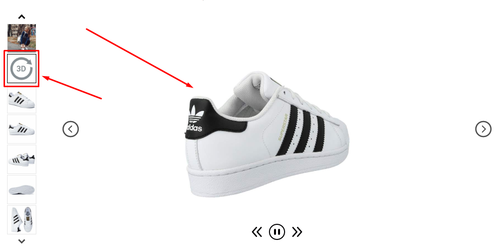
The poor image quality of your products is a real barrier for users who prefer to preview their purchase, even when it is a service. Therefore, the photos should be inspiring, aspiration-oriented to evoke emotions, and positively affect your visitor. It is good that the photos you provide can be zoomed in so that the user can get a more detailed idea of them. If your products allow it, you can upload 3D

- „Error 404: File 404 not found”
The 404 error is one of the most frequent and common problems in online stores. Many retailers, instead of marking the product as unavailable, delete it directly. This action causes these 404 errors, their increase leads to a decrease in organic traffic and social signals on the site. It’s a good idea to fix these 404 errors by 301 redirects to similar content, whether it’s a product or a category. It is also a good idea to make this 404 page more informative and to make it as easy as possible for your visitor to find what he is looking for – add a search engine, site map, contact form, offer them a discount code.
10. Unclear or missing product return conditions
It is a good idea for the link to the complaint form, as well as the information about the conditions for returning items is located in a visible place in the online store.
